And the Oscar for Best Short Animated Film went to The Lost Thing, by Andrew Ruhemann and Shaun Tan!
The film won the Professional Juri award for Best Soundtrack on Anima Mundi 2010.
Watch the trailer below and remember it!
Monday, February 28, 2011
Sunday, February 27, 2011
Saturday, February 26, 2011
Site News: Free Warlord Sprues

Wayland Games are offering free sprues from Warlord Games, who specialise in historical miniatures. All you need to do to redeem your free sprue, is fill out the following web form:
And thats it, enjoy your free miniature!
Thanks for reading,
DiStudios
The 14th Legion
Site News: Calendar and stuff

Family stuff today, so I don't think I will get any table and brush time tonight. However I would like to introduce the new calendar feature; found below the site banner. Mainly a tool to keep me motivated, the Schedule page will give readers a brief break down of my projects. While this will not affect my daily blog posts, it will give readers an idea when final product posts days are, or (in future) when I am fully booked for commissions. It will also let readers know which events I will be attending this year and any painting competitions (on-line or otherwise) I may be involved in.
Thanks for reading,
DiStudios
The 14th Legion
Friday, February 25, 2011
3D Animation. Completed 3D Character Animation
Here is my finished and rendered 3D character animation. After identifying the problems in my previous post, I started to find it easier and easier to perfect the movements within the animation. Although I produced a rough storyboard, I did change my ideas as I progressed with animating on Maya. The reason for this is I found better ways of showing character and expression more effectively than what was on my storyboard. If I were to stick strictly to it, my animation would be very dull and lifeless. Although I should have followed my storyboard, I think it was okay in the sense as I had no idea what the sequence would've looked like in 3D, considering animating and using Maya was new to me. So adding and enhancing the majority of the motions seemed ideal for my animation, and I did stick to the basic idea of the story board I originally made. It was basically that with added features, such as more facial expressions and secondary actions to purely enhance the animated sequence.
The actual additions I made appealed for both characters in the animation. I wanted them both to represent their roles stated from my storyboard, with that element of a victim and main threatening character. This was devised from the sound clip I chose, because of it's fearful presence, it felt right to represent that through this animation. That is when I came up with the idea of having a character creeping up to another to frighten him/her. Once that basic idea was planned out, I began animating it through onto Maya, where from there I could analyze the data and enhance movements that I think would make my animation stronger. For example, to start off I had the 'creeping' motion very basic, but after close analysis with the sound, I discovered shuffles that would replicate a different sort of motion. It was then that I thought to make the character appear to drag the foot alongside him, to add to that 'scary' appeal of my animation. Adding that drag to the foot made the character have much more 'edgy' personality which helped highlight that element of fear I was after. In addition to the creep cycle, I alter and moved the facial expressions to give the character that personality of being a truly frightening figure. This was done be altering the eyes and mouth into more exaggerated poses, such as wide sinister smiles and dramatically inverted eyebrows.
For the 'Victim' character, everything had to reflect from the sound clip and the action from the main opposing figure. I wanted to add a bit more character to the victim, so I paid specific attention to the emotions before and after the action from the other character. I made the victim appear relaxed and content, until when the other character gets right close behind (where the dialogue begins) he becomes shocked and fearful of the figure behind. This adds personality to the character and allows us to understand the mentalities. Because the victim doesn't play a specific action based role within the sound clip, I added motions to further enhance his personality. Elements such as rolling of the eyes, scratching and tapping the foot. Once the other character interacts, I over dramatized his emotions by stretching the body out with both facial expressions, hands and legs. I really wanted to portray the fear within this figure, so I added an extra emotion of 'nervousnous'. I represented this by radical shaking of the knees and eyes, whilst the arms and hands scrunch over the face (to potentially hide his eyes from the foe behind)
Within doing these extra animations, both characters gain specific roles that clearly represent their personalities. Although I am still very new to Maya, I have come to understand the importance of posture and expression through the face and body languages. I have also learned the importance of researching motion, as it greatly helps within understanding the mechanics of animation. Without it, it would be impossible to be able to represent accurate and fluid movements. Although it seemed simple enough to start with, I soon found that the 'easiest' of movements required a lot of study, so I could replicate the motions with success. Overall, I have found animating in Maya quite difficult, but in the same sense exciting and I often found myself ambitious to play with new things in order to make my animation better. I am glad I chose 3D as I have learned so much about a new type of art.
The Oscars are coming!
The Oscars are coming! Sunday (February 27th), the Academy of Motion Pictures Arts and Sciences will award the previous year's best films. Among the animated films selected by the Academy are some that have been brought to Brazil by Anima Mundi - and three of those have been awarded here!

In 2010, Anima Mundi screened the French short Madagascar, Carnet de Voyage,which won Anima Mundi Directors' Award and Best Art Direction Award by Professional Jury. The Gruffalo was one of the favorites of the public and it was chosen by the Jury in 1st place as Best Short for Children and SP in 3rd place in Rio. The Lost Thing carried the trophy for Best Soundtrack by the Professional Jury.
See the list of nominees Animation 2011 and place your bets!
Animated Feature Film
Toy Story 3, Lee Unkrich (USA)
How to Train Your Dragon, Dean DeBlois and Chris Sanders (USA)
The Wizard of Sylvain Chomet (France / England)
Short Animated Film
Day & Night (USA), Teddy Newton (Pixar)
The Gruffalo (England / Germany), Max Lang and Jakob Schuh
Let's Pollute (USA), Geefwee Boedoe
The Lost Thing (Australia / England), Andrew Ruhemann and Shaun Tan
Madagascar, Carnet de Voyage (France), Bastien Dubois
Grand Mother is here!


The new box is a fraction the size of previous releases but does come stamped with the figure artwork, which is a nice touch. I am very much in favour of the large deck protector plastic cover, as for me it keeps the stock card art safe from being crushed and adds even more of a collectible feel to the product. I am happy to see that once again I have gotten a low number (nerd I know!).

I like this additional art piece, more art is always welcome in my mind so no complaints there! The red ribbon is a sensible addition as the components sit very snuggly in the smaller box design and would require you to squeeze your fingers if no ribbon were present.

Almost all the figures I have worked on this year have been of a larger scale, I found myself surprised by the actual figure size especially after I compared it to the Man-Hunter and White Lion. Grand Mother is a delicate looking (and sized) figure with much the same dimensions (except for birthing chamber) as the White Speaker model. So care should be taken when dealing with this figure, as some of the components are very thin and will not take pressure well.

The wings are some of the nicest I have seen, with each wing being heavily detailed, I have lots of ideas running through my head about how to make the detail 'pop' once I start painting.
The change of packaging looks to be a good thing, previously KD Games provided quite large boxes to accommodate the card stock, and lots of bubble wrap. I would suppose that the smaller box design is intended as a more cost efficient way of protecting the components but without sacrificing the boutique image that is associated with the company, the design is very unique in my mind. There have been many Fantasy styled angelic creatures before and I am pleased to see a figure, while very recognisable is also very unique compared to others on the market. Coupled with a dark lore Grand Mother is a excellent deviation from the standard heroic Angel image. I am very pleased with this figure and am looking forward to starting it next week, I would start it now, but I started the Man-Hunter so intend to finish him first.
Thanks for reading,
DiStudios
The 14th Legion
Wip: Kingdom Death's Manhunter

I have decided to keep the KD games momentum going and putting on hold my Anima Tactics collection. I have now committed myself to painting the Manhunter as a companion to my newly finished White Lion. I really like how large this figure is and I am hoping to make the skin really stand out using washes and glazes. One of the key things I am trying to decide on, is how to deal with the browns. The trench coat almost screams to be painted a dark brown but I am afraid that it will clash too much with the hang man's frame and rope. I need a colour break to keep the figure interesting and stop it becoming a big brown mess, I also want to try and capture a 'dusty cowboy' feel, so my MIG pigments will probably come into play in the final stages of this paint job.

This will most likely be the last Kingdom Death figure I will be able to complete before "Grand Mother" arrives, then the priority shifts as I am really keen to work on their latest figure. While there have been many Angelic miniatures released in the past, what captivates me with "Grand Mother" is the elegance in design and pose that seems to be lost in a lot of Angel esque figures I have seen in the past. Couple that with a interesting spin on the lore, makes for one very interesting model.
With some luck and a lot of coffee, Manhunter will be complete by the end of the weekend.
Thanks for reading,
DiStudios
The 14th Legion
Thursday, February 24, 2011
Gallery: The White Lion
"Huge terrifying lions with a strange human curiosity and human hands. Their white fur shines with flecks of gold when the sunlight hits them directly, a strange contrast to their bloated and sad faces. They are a dominant predator in the holy lands and have become a symbol of inspiration and beauty for the entity that resides over all. Occasionally they are trained and kept as partners by Man-Hunters."
I had a number of minor mishaps painting this figure, from little bits of crap getting into the paint to stealth mould lines I only noticed after priming. I had originally decided on a cold colour set, but the image of gold flecked fur in the sunlight (in the description) caught my imagination, so I went for a more regal and warmer colour set to reflect what I envisioned as a golden aura. As much as possible, I stuck to the description and painted the front arms in human skin colours and I also added colour to the wrinkles on the face also to bring out the sculpted features. I am happy with the outcome as I feel the finished article captures both the powerful predator and saddened human features.
DiStudios


Wip: Kingdom Death's White Lion

The White Lion is complete and I am currently prepping for the photo-shoot. If all goes well it will be up within the next few hours. It was actually quite a stressful job to complete as all manner of complications occurred ranging from; poor colour choices, particulates in the paint to overly heavy primer. I think the final result is pretty good considering all the problems I have had with it. In the end it is vastly different to how I had originally envisionaged it, but in a positive way, which is always a good thing.
Looking forward to posting the photos soon!
Thanks for reading,
DiStudios
The 14th Legion
words, worlds, and dolls
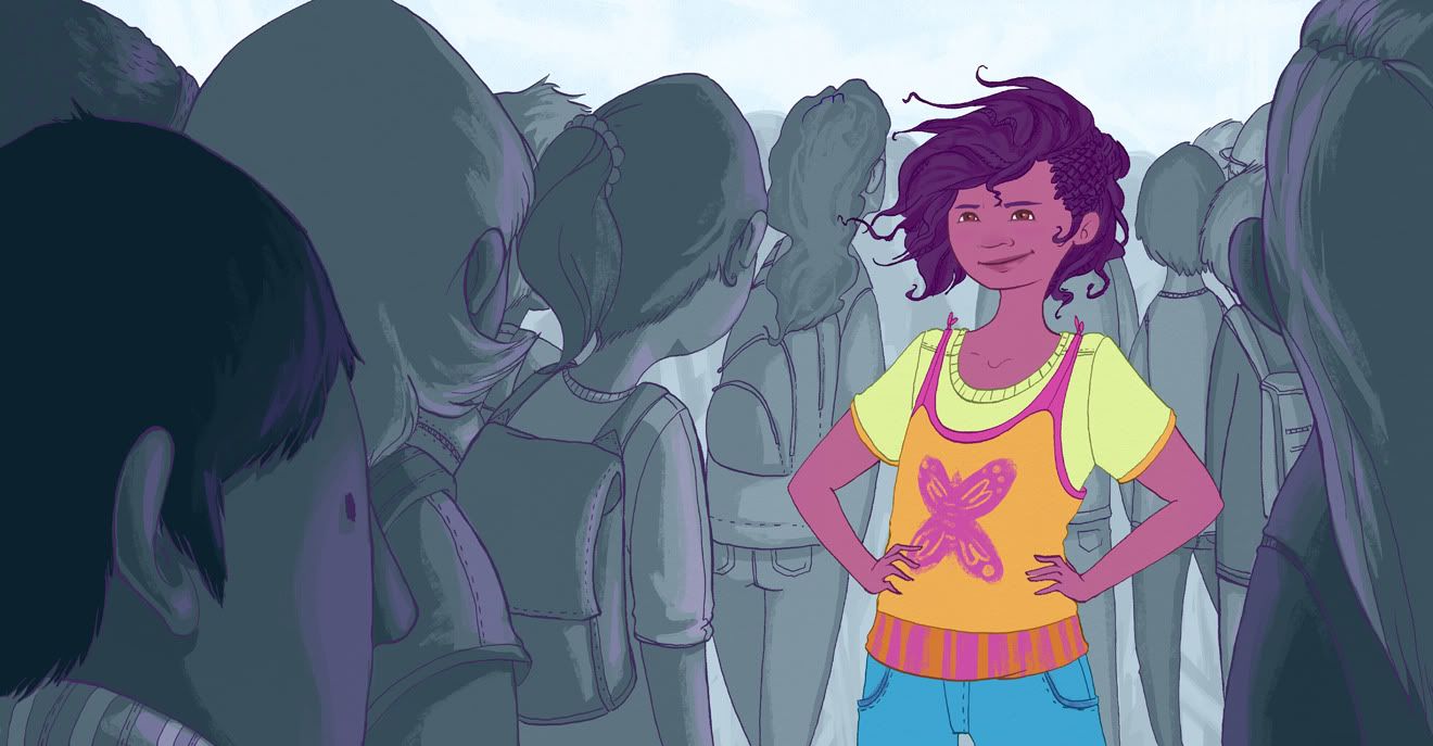
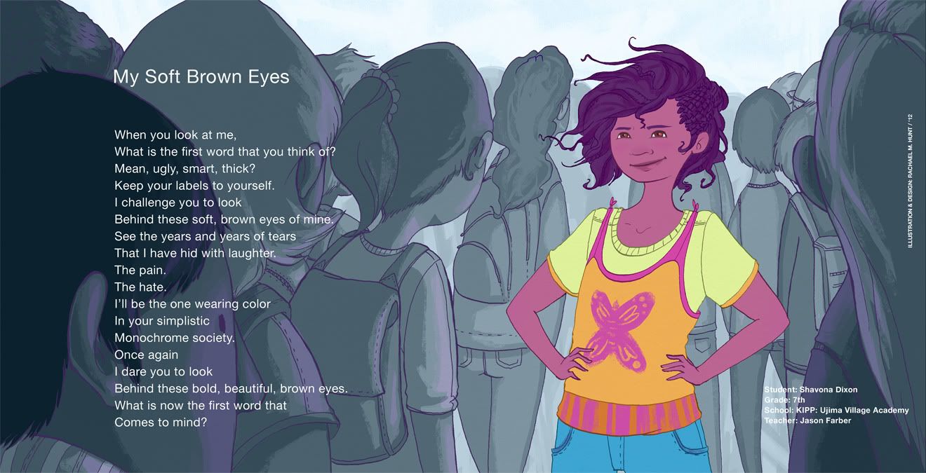
Here is some more stuff I've done for school. The first two are for Words on Wheels, a partnership MICA has with the Baltimore grade schools. The students write poems and then some are given to the students in some of the Concepts II classes to illustrate. The size and format are very specific in that we were not allowed to alter the font or shape of the student's poems. The first image is just my illustration and the second is with the student's poem. We are going to submit fully formatted prints of our work and they will be judged and the winning illustrations will be printed and featured in the city buses :)
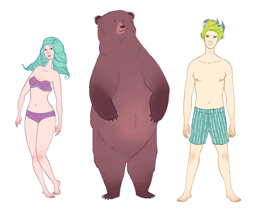
The next image is of the "paper" dolls that I made to dress for my Lifestyle illustration class. Each week we are supposed to dress the dolls in clothes from any designer of our choosing.
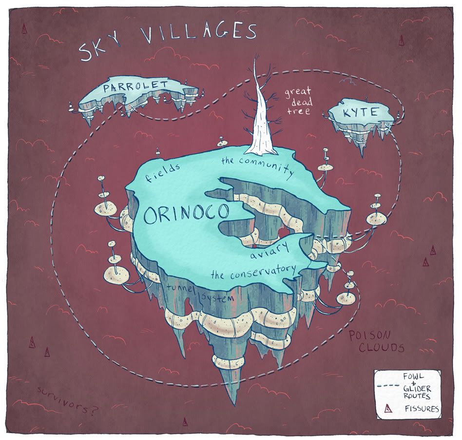
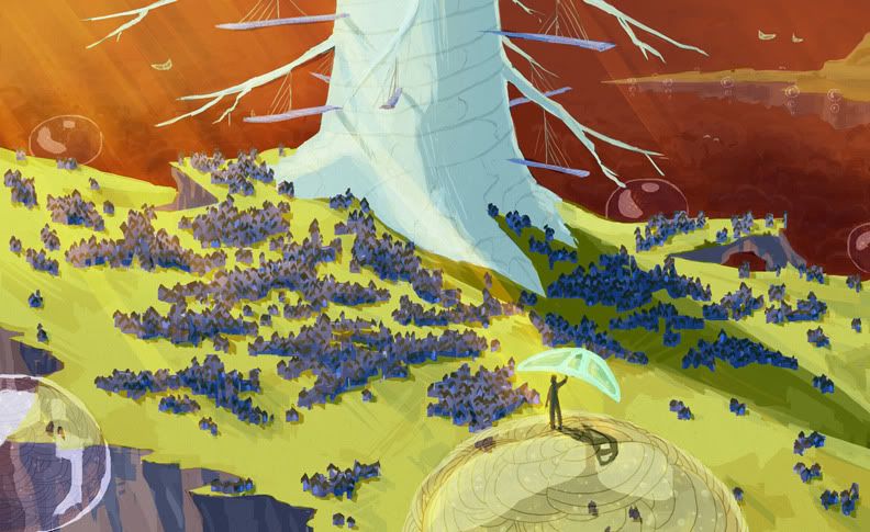
The last two illustrations are for my Advanced Concept Art Class. That class is built around world building. Each student is creating their own world from scratch and each project is meant to explore that world. The illustrations are of a tentative map of my world and also a "beauty" shot of the environment. This is a huge learning experience for me because I have never really worked with concept environments before. I am learning a lot. Both illustrations are actually second tries of my first attempts. In a nutshell, my world is a planet now covered in a poisonous cloud. I am focusing on one of the three villages that were able to escape to the skies before the entire world was consumed by the poison. The inhabitants use gliders as a main form of transportation between the floating villages. Pretty cool.
Wednesday, February 23, 2011
Wip: Deathwing Squad #1

First squad is built and cleaned, no shoulder pads however as I am waiting on a Forge World order to arrive (tomorrow should be the day). While I really like the Space Marine Terminator models but find them very plain when compared to the 2nd edition Deathwing Terminators.

So the next very obvious question, how to make my Deathwing more Deathwing? The most iconic thing about the Deathwing is of course the white armour, but other than this we have the Kimmeria tribal feathers and ceremonial daggers.

The daggers are easy to take care of, the Space Wolves accessory set or the Sanguinary Guard sets have some very nice daggers which are usable for on the figures and make them less standardised in look and more identifiable like their fanged brethren.

But should Deathwing Terminators have feathers? As stated above the tribute is in the colour change and not all Deathwing (or Dark Angels for that matter) originate from Kimmeria, so it would surely be unwise to start throwing feathers on all of them (although the current Dark Angels range seem to be very feather laden).

Reaching a compromise has proven pretty difficult, and could be summed up as go feather or don't if you want your Deathwing to have personality. This seems to be the problem with Dark Angels generally, they have gone from black armour to green and going from feral, tribal aspirants (in terms of recruitment) to former knightly order space monks.
What do you think? Do Deathwing need feathers to be Deathwing, or should the tribute be solely in the paint job?
Thanks for reading,
DiStudios
The 14th Legion
Inspired? Get your wargaming goods from: Wayland Games - Discount Wargames


Tuesday, February 22, 2011

Monday, February 21, 2011
Site News: New Gorm photos!
Right, I was really unhappy with the state of affairs of my miniature photos. SO after a really tall cup of coffee (its 2:44am here) and a crash course in how to use my digital camera and GIMP, I have re-taken the Gorm photos. I think these are a lot better than the ones I posted last week, you can definitely see the different colours I have put into the figure.
Check out new Pictures HERE
A few important things I have learnt from this re-shoot (Thanks for the guidance Mr Poots!):
- Always keep your Raws! (original pictures), you never know when they might be needed!
- GIMP is your friend! (Editing software)
- The iPhone is not a suitable camera replacement!
- Photobucket is not a suitable substitute for decent editing software!
I will be remembering these points for all of my up coming photo shoots, so more eye candy and less eye bleeding from 14th legion.
Thanks for reading,
DiStudios
The 14th Legion
Make sure you check out the great range of Kingdom Death figures. I promise you, you will not be disappointed! CLICK
Wip: Belial Part 1

I have magnetised the arms to allow different weapon configurations but for now he is equipped with a Power Axe (Thunder Hammer) and Storm shield. I will be creating options for the Sword of Silence and Lightning Claw load outs.

The cloak is still in the rough shaping phase and I will be adding more folds and detail as the week progresses. There are also smaller details such as icons and badges still to add and some basing ideas I have been playing around with, but this will depend on whether or not it starts to look to busy. ideally I would like this figure to be close to completion by end of this week so I can work on the bulk of the Deathwing army, but this will depend on the arrival of bits orders.

The nice thing about this conversion so far, is that it has given me a lot of ideas to implement on Belial's bodyguard. I want to make sure the unit has unique identity on the table but also fit in with the rest of the force and so far I feel Belial's design keeps with that idea, furthermore it has given me a bit more confidence in sculpting full robes (especially on Terminator armour), I prefer the idea of Dark Angels having full robes over tabards as I view the tabards as more of a Black Templar identity.

A army list is ready and I will share the details as the project progresses, perhaps concluding around the Easter holidays. I apologise about the blurriness of the photos, not quite sure what has happened there, I promise that the next Belial update will have far better eye candy.
Thanks for reading,
DiStudios
The 14th Legion
Inspired? Get your figures and supplies from:Wayland Games - Discount Wargames
Subscribe to:
Posts (Atom)