1) Squash and Stretch:


2) Anticipation:

Within the good animation example, anticipation plays a very important role within the 12 principles. It is an element which is used to enhance the action and realism of a scene. However, within this part of the animation, there was a section in which could of had a lot more potential and strength. In the image above, the character is about to throw a weapon at the hero of the video, but uses little expression or force in actually projecting it. There is no overlapping action or secondary movements, but a simple robotic arm swing. This disabled the suspense elements because of the lack of emotion in the movement, which really makes this certain scene bad in terms of both story telling and the 12 principles.
3) Staging:
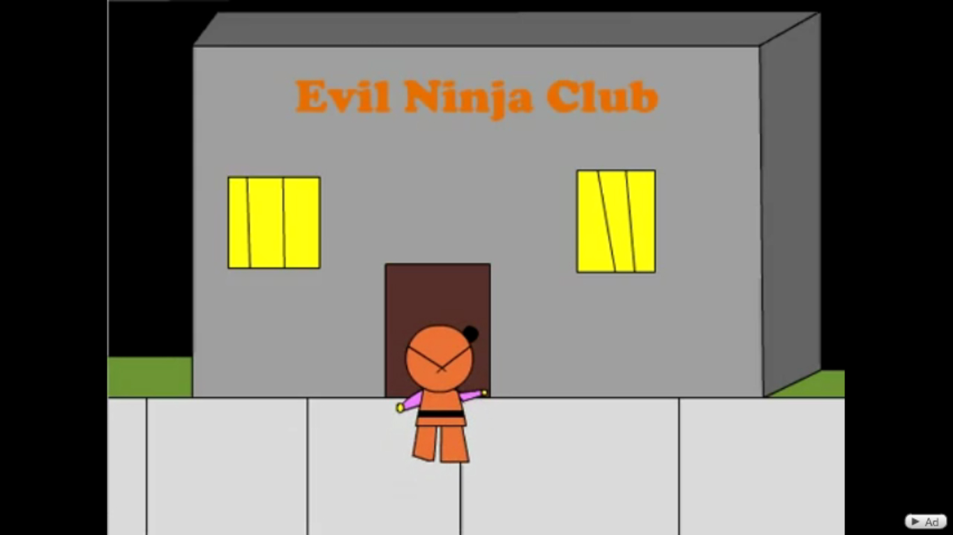
Staging is an important element with any form of video, as it emphasises the theme and gives us as the audience more information as to what is going on. In this image it isn't exactly clear to represent how I felt when I actually watched it, but although this seems simple enough by the setting in this picture, you still felt like you weren't 100% sure what the purpose of the video was. From this image alone you get the impression that this character is going into this structure in order to fight. However, it's not really evident why this is actually happening, because irrelevant things take place within the animation that through you off balance of what's really going on. For example one minute there is fighting, the next there is a dancing skeleton on a dance floor. You feel confused and unsure what the purpose of the animation was, which I think is poor staging.
4) Follow through and overlapping action:

In this image, the two characters are fighting each other with what appears to be exaggerated judging by the amount of rotations etc. However, this scene lacks any other form of animation to the details of either characters. For example, within this combat sequence, the characters are jumping and falling all over the place, but the only parts of the character that seem to have mobility are the hands and legs. No part of the clothing or facial feature moves in reaction to the combat that's taking place, which really takes away that sense of realism and quality of a brutal fight.
5) Slow in Slow out:


In this part of the video clip, i noticed a prime example of how the animator has not taken into the account, the speed in which it takes to do certain motions. In the images above, the character on the left takes a jump in order to kick the character in black. However, in this sequence the character looks as if he slowly flies or hovers upwards instead. There is no sense of speed at the start of the jump, or after as he falls back down. It has a unrealistic look to it for that factor within this fighting scene.
6) Arcs:


In the best animations to date, Arcs are used to emphasise the fluidity of movement and accentuate realism. Granted this animation is a cartoon and isn't exactly accurate in terms of realistic, but it still lacked personality and thought in which could have made this animation bolder. For example in the images above, the character takes a simple two frame arc with his arm in order to paint a picture on the easel. However, the only animation in that part is just the two key frames, start and finish. There was nothing in between to enhance that fluid brush stroking arc. Aside from that, there is no evidence of the character actually making that stroke with the paint, what seems to appear is a green line below the transition, which says to me that the whole arm movement was pointless in terms of relevance to what was happening.
7) Secondary Action:

In this image, the character jumps up to avoid a thrown weapon. The actual jumping transition contained no other principles to enhance this motion, so it just stayed solid as it arched in the air. The only added feature in order to highlight this action was that of the character closing his eyes as he made the jump. However, this didn't really add to the hype of missing the weapon at all, as no other forms of movement took place to highlight the action. It would have been better see a change in the position of the arms, legs and how the head would tuck into the body when performing this sort of move. Leaving out these details ended up making this scene lifeless and very dull.
8) Timing:

Timing is used to correctly coordinate actions within an animated sequence. It is also used to show drama and exaggerate what's happening in the scene to give it more visual depth. Without it, action would simply not happen successfully within animation or any other variation of film. In this fighting sequence, the character is jumping out of the way from a thrown weapon. The rate in which the weapon flies however, is extremely slow for any thrown object. It seems to fly more than be thrown. This results in an unrealistic attempt to show suspense within the drama, simply for the fact that this scene has more frames in it showing the weapons flight path, than the character actually dodging it.
9) Exaggeration:

As stated in the previous blog post, exaggeration is used to express emotions and personality within productions. Adding this element immediately gives the sensation of feeling connected with what's going on, by the use of over exerting expressions in order to set a mood. In this animation, the character randomly has a scene in which his expression changes and what appears to be fire behind him. This is probably the best principle in which the animator managed to do okay in terms of trying to set up an emotion within the action. By adding the fire and changed expression, you can get into grasps of how the character is feeling and what could potentially happen. However, due to the lack of follow other principles such as appeal with the facial expressions and solid drawing for the fire, this scene lacked visually pleasing depth and didn't really change how I felt about the action that was taking place.
10) Solid Drawing:

This part of the video contains a scene, where the skeleton above starts to dance. This is an example of solid drawing where the producer would have taken pre-existing knowledge from studying the human anatomy. However, it is evident from this image, that the animator had little clue of what the human skeleton includes. This shows lack of preparation and study as the figure is entirely incorrect anatomically.

This image really says it all. That main character within this video clip is proclaimed to be 'a good ninja' or in other words the protagonist of the sequence. To be honest, if i hadn't of noticed this part of the video, i would have assumed that this was just a random video. But this text pretty much highlights what the rest of the video would entail, good versus evil. The character then obviously lacks appeal to begin with, because the producer cannot portray his good intentions through any other animation, so resorts to text in order to make it clear at the start of the clip.
Video Reference: http://www.youtube.com/watch?v=JVl8UOhtKZc
oh and on a personal and irritable note. Kung fu fighting and the song is Chinese, the character's in this sequence are Ninjas...and there for Japanese. -___-"
No comments:
Post a Comment