For the first assignment of my Concepts II class we were each given a chapter of the Hipster Handbook and had to do a full page, half page, and quarter page illustration for our chapter. I got the UTF (unemployed trust-funder) hipster. Oh, hipsters. Done with crow quill and photoshop.
For the next part of this unit, I had to make a 3D animated bouncing ball within the software 'Maya'. This task felt daunting at first simply for the fact I had never used Maya before. Thankfully, with the help of the tutor and some production notes, I believe I was able to follow through the software at a good pace. I learnt a great deal of importance with the graphs and the numeric side of the software. These elements are all vital for accuracies and where to pinpoint animation locations, so i had to pay strict attention to them. I often found myself forgetting to add in details and parts of my animation began to take on unrealistic characteristics.
I really enjoyed plotting and playing about with the curves in the graph system. Using the graphs helped me gain more realism within the ball's speed which helped give the animation more visual depth and appeal. Another structure was adding numeric values to my object, as this change the shape and volume of the ball, which really helped in give my animation that 'squash and stretch' principle. What i found more crucial however, was the importance of making 'keyframes' as slightly different with 2D animation in Photoshop, not making key frames in Maya really affects the outlook of the object you are animating. Forgetting to add key frames in important animated sequences in which i discovered (by forgetfulness) made the ball stay in one shape throughout. Making different key frames, pinpoints the impact of force and gravity. However, i found it far more easier within Maya, as making the key frames is fairly straight forward, the rest of the animation is done for you. All I had to do was pad it out with playing with the graphs and adjusting the numbers in the statistics of the object.
Overall I really enjoyed playing with new software, and i felt i did okay considering it was a first try. I found it far easier to animate on Maya than with 2D on Photoshop, as with that software it felt more about traditional 'flipnote' production, and took the majority of animating time, plotting and correct speed paths. I think my animation as whole is good, the only thing I believe looks wrong in my production, is that on impact the ball seems to squash a bit too much. However, I believe I can honestly say it was a simple mistake, as when rendering the images on Photoshop into a video, I took the images of my animation from a higher angle of the action. That's why i think you cannot see the ball's true form with that impact in the animation, as in the initial Maya sequence, the flattening of that force is less dramatic.
For this part of the unit, i was introduced how to make a simple 2D animation on Photoshop. The task seemed relatively simple to start with, as all i had to do was make a small 1-2 second animation of a ball bouncing. However, from the first two animations i produced, i began noticing that there were elements that were stiff, unrealistic and didn't comply well within the true physics of a bouncing ball. It took me roughly around 5 attempts of playing around with the structure until i began to understand the statistics that helped me refine my animations.
First off was to understand the importance of speed, trajectory, gravity and forces. When a ball bounces, it is based on how it was thrown, at what rate of speed it was thrown at and how the object reacts on impact from the rate of that force. As i began playing around with different paths for my bouncing ball, i began noticing patterns in where to go to make the animation look more realistic. Of course the ball's main focus of bounce is depending on what material it was made out of, whether hard or soft etc. For example a tennis ball bounces, but an actual bouncy ball would bounce higher and more rapidly. So different bounces can be based on imagining the material in which the ball was made.
When planning out my animation, i used guidelines in where my ball would bounce and the angles. These angles look like curves/bounces which mimic the course in which the ball will follow. This was 50% of the difficulty, as creating the right amount of curves had to be completely accurate based on how the ball was falling and at what speed. Another important element was understanding how speed worked within the sketches. The more drawings in a section of the animation would slow down the process, whereas less drawings would make the sequence faster. So for example, drawing the sketches for a bouncing ball, there would be less drawn balls when the object is falling to the ground and then there is more balls at the heights of the bounce (where it would slow down) to decrease the speed. In doing this, it adds more realism to the idea of force, gravity and weight. Here is what i figured out whilst sketching the curves and arcs for my ball's trajectory:
. The thinner the arcs (closer together) = The slower the bounce.
. The wider the arcs (further apart) = The faster the bounce.
. Thinner arcs = More balls = Slower speed
. Wider arcs = Less balls = Faster speed
. More balls = more frames of balls = takes more time (slower)
. Less balls = less frames of the balls = takes less time (faster)
Here is an image showing an example of what i mean:
In this image you can see where the ball is at it's fastest and slowest. As previously mentioned, to add the effect of speed as the ball falls to the ground, there are less drawn balls. Whereas, enhancing the slowing down of the ball adds more drawings. The basics in this drawing are evident of the ball slowing down, with the height in which the arcs drop. Also the appearance of more drawn balls highlights the speed reducing which is very visible in this image. As the ball slows down and reduces height, the balls are drawn closer together, which if you think if more frames are drawn the same way would emphasise the stationary appeal of the object, instead of being more spaced apart in the previous arcs.
Here is one example of my animation, where i tried to get to grips with speed, trajectory and force. I didn't pay to much attention to the physical changes of the ball at this time, as i wanted to pay more attention to the directions and heights in which the ball followed. Although the first few bounces seemed pretty accurate, there was no sense after of the ball reducing speed. My arcs reduced height but not width, so there was the error of the ball not slowing down sufficiently after the forces of the bounces. As the ball loses speed, there are more bounces towards the end, which previously stated highlights the visual effect of reducing speed. Also from the first bounce, the ball gradually loses force, which also shows the impact of reduced speed. In this animation, there is no evidence of that after the first bounce.
Here is another example from my test animations. I paid slightly more attention to the physical alterations of the ball, so i had better practice of what the object would look like from the impacts of force and speed etc. I think this animation is good in terms of reduction of arcs and height etc, However, it is far to slow in it's peaks. My error here was that the arc in which the ball initial fled from would of had more speed. I also added more FPS because i wanted the animation to look smoother. However, in doing this it was evident that it slowed down my entire animation because of that factor. It should have been faster to start with, then slowed down, but i misjudged the effects of the guidelines i drew for the balls bouncing path.
I went back to not focusing so much on the ball's appeal this time. As from the previous error, i needed to re-focus on the trajectory of the ball's path etc. I think i did a lot better this time around, as the ball has the correct amount of speed and width of arcs. However, the only element i got wrong, was after the second bounce, i didn't reduce the width so much on that third arc, which would've highlighted the ball slowing down much better. It seemed to wide for the path in which it was taking, but everything else i believe went according to plan. Although truly this is a simple task, it does take a lot of focus to understand the true physics of a ball bouncing. I have probably made about 7 animations now in order to obtain the right idea.
Programmes used: Photoshop CS5 Extended, Quicktime Player 2011
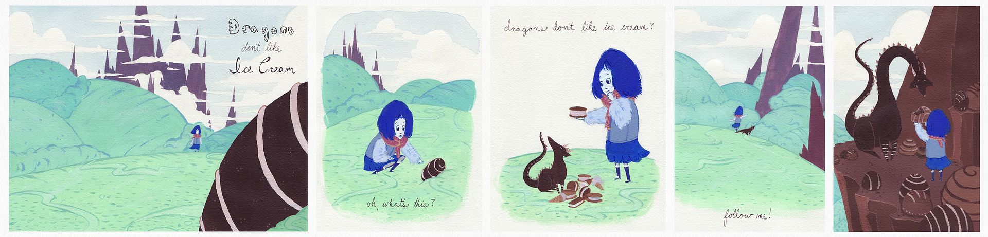
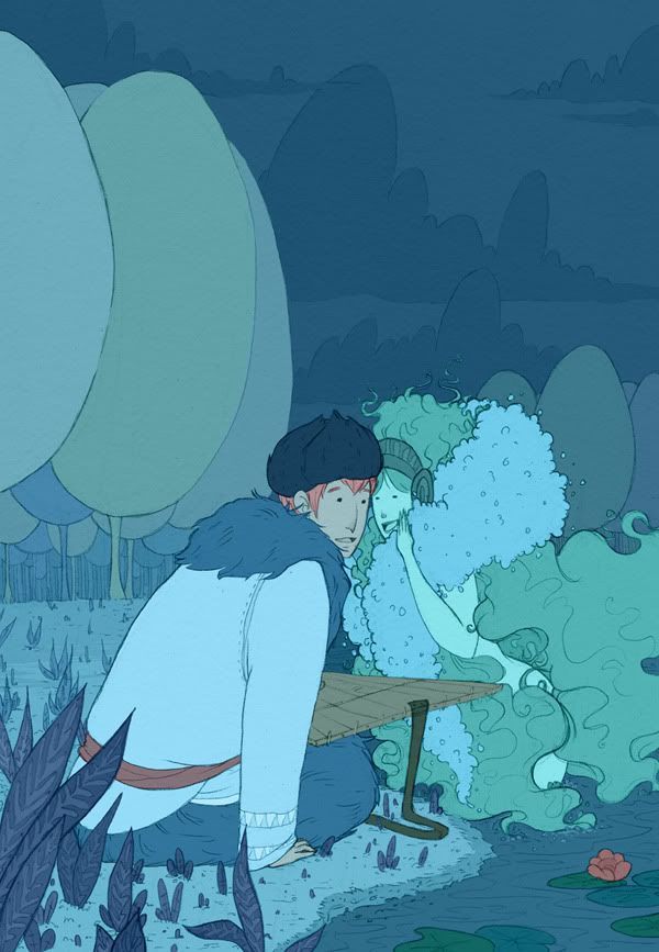
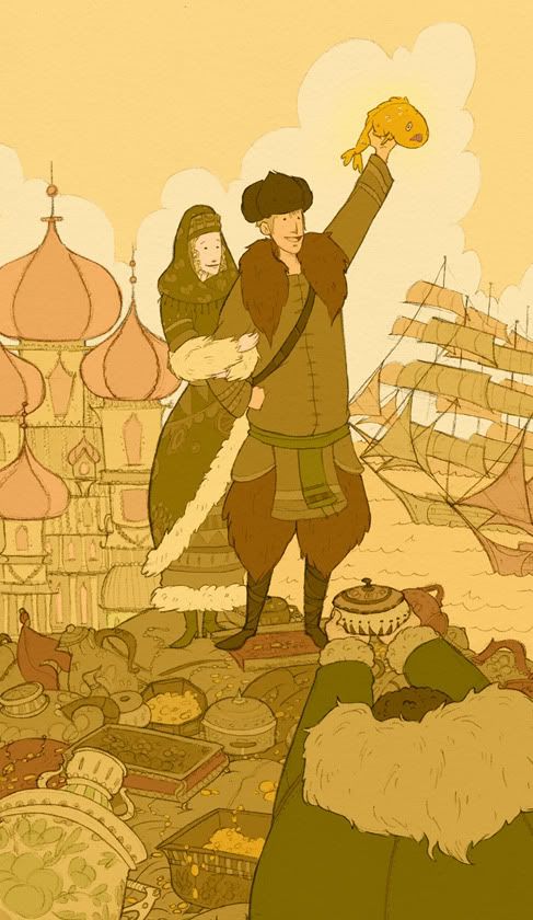
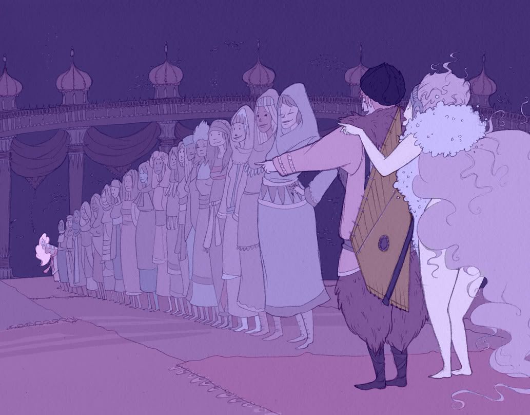
Here's some more work from last semester. The first thing was my final for Concepts I. It was a secret santa final in that all of our classmates had to write an assignment for us on a slip of paper and then we had to randomly draw a slip from a folder and do it for the final. I drew "cute food" and decided to do it as a short (very short) children's story. I just had to do 3 page spreads, which is why it's very short. I did it in acrylics. The last three illustrations were for my narrative color class. For our final we had to choose a story or movie and illustrate 3 scenes from it and use color to help tell the story. I did a Russian fairy tale called Sadko. The tale is about Sadko, a musician, who plays at the wealthy merchant dinner parties. One day, he isn't invited to one so he goes to a lake and plays in sadness. A water elf pops up after he is finished playing and tells him that, since he entertained her dinner guests with his music, she will tell him a secret. She tells him that there is a golden fish in the lake that, if caught and eaten, will grant eternal life. The next day at a merchants party the wealthy men are boasting about their wealth. When it's Sadko's turn to boast, he says that though he has no wealth, he does have a secret about a golden fish. The merchants do not belive him and say that if he can catch the fish they will give him all their stuff. He catches it and becomes a rich merchant himself off of the bet. He has his own fleet of ships, a palace, and a beautiful wife. Eventually through a series of events, Sadko finds himself on the bottom of the ocean at the Sea god's palace being forced to pick a wife from a line of girls so that he will have to stay there forever. The water elf from before shows up and tells him to choose her sister because she will return him to the surface and to his wife. Sadko does this and he is reunited with his real wife and lives happily ever after. That is the condensed version of the story as I fit it into the required 3 illustrations for the class. :) As usual, just click the thumbnails to see the illustrations at full size!
In my last post, I showed the 12 animation principles within a good animation. However, In order to obtain a greater perspective I will look at the bad examples of animation as well. I found it quite difficult to actually find a bad animation, so to aid my search i went onto Youtube and typed in various animation titles that i thought might host bad animations. After a lot of researching, i managed to find a composed music video that represented an animation to the 'Kung Fu fighting' soundtrack. After reviewing it a couple of times, i noticed the appearance where the 12 principles were or should have been. Here are some images from the video to represent what i mean:
1) Squash and Stretch:
Whilst looking at this animation, I found it hard to pinpoint examples of squash and stretch. However, I thankfully managed to find the set images above from a small section of the sequence. The character in the orange seems to have produced a ball of fire in which he projects towards the enemy in blue. Although granted, the ball does change form on impact to highlight that sense of force, but the initial release of the ball had no change at all. I assumed that with something that was meant to have so much force in the impact, should of had more motion or fluidity at the beginning of the action.
2) Anticipation:
Within the good animation example, anticipation plays a very important role within the 12 principles. It is an element which is used to enhance the action and realism of a scene. However, within this part of the animation, there was a section in which could of had a lot more potential and strength. In the image above, the character is about to throw a weapon at the hero of the video, but uses little expression or force in actually projecting it. There is no overlapping action or secondary movements, but a simple robotic arm swing. This disabled the suspense elements because of the lack of emotion in the movement, which really makes this certain scene bad in terms of both story telling and the 12 principles.
3) Staging:
Staging is an important element with any form of video, as it emphasises the theme and gives us as the audience more information as to what is going on. In this image it isn't exactly clear to represent how I felt when I actually watched it, but although this seems simple enough by the setting in this picture, you still felt like you weren't 100% sure what the purpose of the video was. From this image alone you get the impression that this character is going into this structure in order to fight. However, it's not really evident why this is actually happening, because irrelevant things take place within the animation that through you off balance of what's really going on. For example one minute there is fighting, the next there is a dancing skeleton on a dance floor. You feel confused and unsure what the purpose of the animation was, which I think is poor staging.
4) Follow through and overlapping action:
In this image, the two characters are fighting each other with what appears to be exaggerated judging by the amount of rotations etc. However, this scene lacks any other form of animation to the details of either characters. For example, within this combat sequence, the characters are jumping and falling all over the place, but the only parts of the character that seem to have mobility are the hands and legs. No part of the clothing or facial feature moves in reaction to the combat that's taking place, which really takes away that sense of realism and quality of a brutal fight.
5) Slow in Slow out:
In this part of the video clip, i noticed a prime example of how the animator has not taken into the account, the speed in which it takes to do certain motions. In the images above, the character on the left takes a jump in order to kick the character in black. However, in this sequence the character looks as if he slowly flies or hovers upwards instead. There is no sense of speed at the start of the jump, or after as he falls back down. It has a unrealistic look to it for that factor within this fighting scene.
6) Arcs:
In the best animations to date, Arcs are used to emphasise the fluidity of movement and accentuate realism. Granted this animation is a cartoon and isn't exactly accurate in terms of realistic, but it still lacked personality and thought in which could have made this animation bolder. For example in the images above, the character takes a simple two frame arc with his arm in order to paint a picture on the easel. However, the only animation in that part is just the two key frames, start and finish. There was nothing in between to enhance that fluid brush stroking arc. Aside from that, there is no evidence of the character actually making that stroke with the paint, what seems to appear is a green line below the transition, which says to me that the whole arm movement was pointless in terms of relevance to what was happening.
7) Secondary Action:
In this image, the character jumps up to avoid a thrown weapon. The actual jumping transition contained no other principles to enhance this motion, so it just stayed solid as it arched in the air. The only added feature in order to highlight this action was that of the character closing his eyes as he made the jump. However, this didn't really add to the hype of missing the weapon at all, as no other forms of movement took place to highlight the action. It would have been better see a change in the position of the arms, legs and how the head would tuck into the body when performing this sort of move. Leaving out these details ended up making this scene lifeless and very dull.
8) Timing:
Timing is used to correctly coordinate actions within an animated sequence. It is also used to show drama and exaggerate what's happening in the scene to give it more visual depth. Without it, action would simply not happen successfully within animation or any other variation of film. In this fighting sequence, the character is jumping out of the way from a thrown weapon. The rate in which the weapon flies however, is extremely slow for any thrown object. It seems to fly more than be thrown. This results in an unrealistic attempt to show suspense within the drama, simply for the fact that this scene has more frames in it showing the weapons flight path, than the character actually dodging it.
9) Exaggeration:
As stated in the previous blog post, exaggeration is used to express emotions and personality within productions. Adding this element immediately gives the sensation of feeling connected with what's going on, by the use of over exerting expressions in order to set a mood. In this animation, the character randomly has a scene in which his expression changes and what appears to be fire behind him. This is probably the best principle in which the animator managed to do okay in terms of trying to set up an emotion within the action. By adding the fire and changed expression, you can get into grasps of how the character is feeling and what could potentially happen. However, due to the lack of follow other principles such as appeal with the facial expressions and solid drawing for the fire, this scene lacked visually pleasing depth and didn't really change how I felt about the action that was taking place.
10) Solid Drawing:
This part of the video contains a scene, where the skeleton above starts to dance. This is an example of solid drawing where the producer would have taken pre-existing knowledge from studying the human anatomy. However, it is evident from this image, that the animator had little clue of what the human skeleton includes. This shows lack of preparation and study as the figure is entirely incorrect anatomically.
11) Appeal:
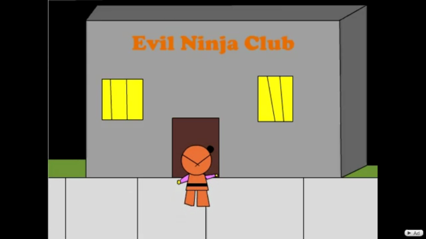
This image really says it all. That main character within this video clip is proclaimed to be 'a good ninja' or in other words the protagonist of the sequence. To be honest, if i hadn't of noticed this part of the video, i would have assumed that this was just a random video. But this text pretty much highlights what the rest of the video would entail, good versus evil. The character then obviously lacks appeal to begin with, because the producer cannot portray his good intentions through any other animation, so resorts to text in order to make it clear at the start of the clip.
oh and on a personal and irritable note. Kung fu fighting and the song is Chinese, the character's in this sequence are Ninjas...and there for Japanese. -___-"
Animation today has crucial principles in which should be followed in order to make a successful production. To show examples of these principles, I have taken screen-shots of a favoured animation. 'Geri's Game' was the first short film animation from 'Pixar' studios back in 1997, just after the release of 'Toy Story'. I chose this particular production because of it's attention to detail within the 12 animation principles.
1) Squash and Stretch:
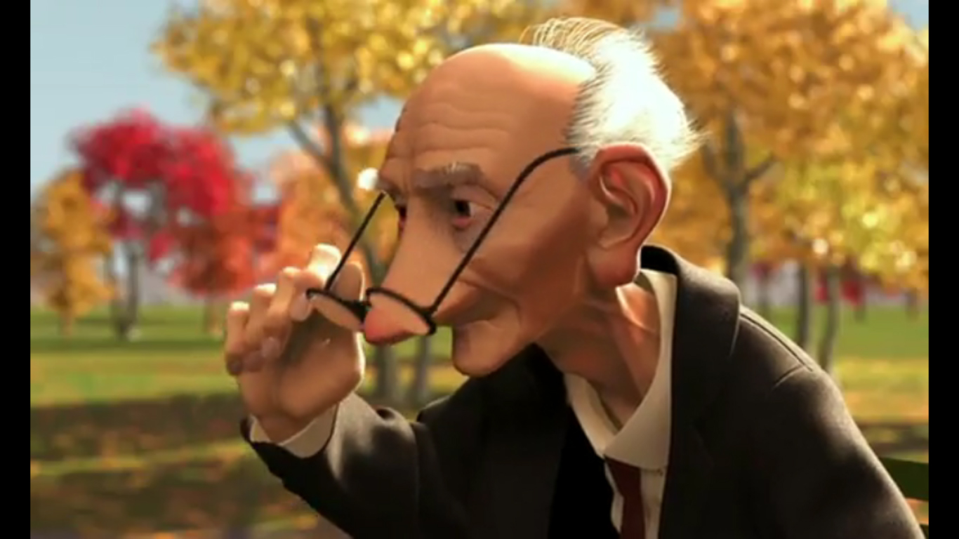
This sequence of the film, i believe successfully shows the principle of 'Squash and Stretch'. The reason for this is due to the attention to the facial anatomy with both skeletal and muscular structure. In this image we can see that with this smiling expression, the muscles in the character's face contract and distort it's original shape. From this expression the cheekbones are risen and the mouth is broader, which emphasises the emotion. This is the reason that the face becomes squashed vertically and stretched horizontally.
2) Anticipation:
Within the film, I found multiple components in which resembled the anticipation of the action taking place in the story. In this image, the character needs to think strategically before he decides to move correctly. You can identify the decision making through the facial and bodily language. The character's hands are held back yet poised ready to make the move, whilst his eyes move around the board in which he would be calculating his next position. In this current stage the opposing side is more confident and has better chance of winning, and because of this the suspense for the other side to win is higher.
3) Staging:
As you begin watching this film, you have the basic idea that this character is going to play a game of Chess. However, it soon became evident from this shot what exactly was going on. You can see that in fact this character is going to play against himself. As with a vast amount of Pixar animations, humour is evident in ways that you probably wouldn't expect and this is a prime example within 'Geri's game'. From this one image I can determine what the rest of the story would entail.
4) Follow through and Overlapping action:
Although it's not really easy to see from these images, this principle is clearly represented within that scene of the film. In this certain sequence, the character's dramatic motions from when he falls off his chair are in four solid poses. In each pose he pulls, his glasses move in a delayed reaction from the force. In the first image the character rocks back, the force from the pose causes the glasses on his face to also rock back in a slightly delayed manor, a bit like a knock off effect. The same follows with the second image, when the figure projects himself forward in a quick fall, from this force that glasses then fall forward off his face. The glasses move within a rippled effect from the force, which gives the animation a more realistic. Paying attention to the weight structural elements gives an animation more realism and life, not everything is as solid as it seems. This sequence in 'Geri's Game' perfectly shows an example of how animators pay attention to the 12 principles.
5) Slow in and Slow out:
For animations to look realistic, they need to abide by the laws of physics. For example if i was to bounce a ball the rate in which it would bounce would go from fast to slow depending from the force of the throw and gravity. Although these images aren't clearly representing the physics, they do in another way add to the personality of the character and the rate in which the story progresses. The character comes across as quite a fragile old man, who takes time with his movements, this is shown within this principle of animation. He takes his time walking to and from the chairs around the table, in fact in these series of photos 4 of them showing that process. The two main images are where the character moves a chess piece on the board. The action was so fast that I could only capture two screen shots and one with which had a lot of motion blur. This shows the other side to the character's personality within the story, where one side is careful and slow, whereas the other is fast and confident. Using this principle within the animation makes the audience understand the personalities of the character and also how the story is progressing.
6) Arcs:
Within animation, no motion is stiff or solid. One way to portray fluidity is by using 'Arc's within the structure of making an animation. To demonstrate what I mean, I have taken a series of screens from a particular sequence within the film clip of 'Geri's Game'. Although it may not be entirely evident from these images, you can see two forms of arc movement. The first is with the motion of the arm putting on the glasses to the character's face. The arm swerves up from the chest of the character up to the face. The second motion which is clearer in these images, is the direction in which the actual glasses move to the face. It resembles the same movement as the arm, but is more arced because of the way glasses are put onto the face. For example the bent section of the glasses arms are made to wrap around behind the ear, so in order to put them on properly you have to turn the glasses around the face in order to fit them properly. This is an arc within the animation that shows realism and also that no function is ever stiff or rigid.
7) Secondary Action:
Secondary action is where little animated details are added to highlight the action taking place within the story. These can vary from facial expressions to bodily movements, for example a man could be running and then itch his head, or wipe sweat from his brow. These other factors in addition with the main action, enhance the emotion and atmosphere. Within the animation I have chosen, I chose a basic facial change in which added to the story progression. The character has successfully beaten his opponent in a game of chess and from the victory has won an award. He is sitting with his arms folded with a smiling expression, However he also adds a 'chomping' like action with his mouth, almost to insinuate what his award would entail. True enough, at the end of the animation he won himself some false teeth, so that is where that previous action relates to the final outcome. Details like that, give the situation a subtle yet more realistic feel with both the personality of the character and the plot progression.
8) Timing:
Timing is a very important principle within animation fundamentals. Every part of an animation needs timing and pace in which the story can progress and take form. With all the other principles included, timing is needed to keep the order of action and suspense etc. It is also used to emphasise the weight and volume of objects and the anatomy. For example, if I knocked over a glass of water, there is timing in which how the weight of the fluid in the glass would affect the speed in how fast the glass would fall. Taking into account those elements would result in a realistic motion, which is what should be aimed for. In these images from 'Geri's Game' the character knocks over a chess piece whilst he is playing. The animator here has cleverly taken into the account the elements of weight and force in which the object was pushed. Although it's not very clear in these images, the rate in which the piece functions and moves is very realistic and believable. It wobbles, rotates and moves in all different rates of speed based around the impact of the force. This is a prime example of how timing is effective to achieve a realistic look and also to show the understanding of how objects would react depending on there characteristics, such as weight, shape and structure.
9) Exaggeration:
Exaggeration is used a lot within animation to portray personalities and emotions more effectively. Without using these forms of drama, animations can become dull and a bit lifeless. Overdoing it, gives a really sense of what's going on and also adds to the mood of the story or theme etc. For example, facial expressions can be over exaggerated in order to fully express the concept within an animated story. In these images, you can see how the character is exaggerating a scene in order to portray what's going on within this certain part of the plot. The facial expressions are enhanced and strained in order to get across the feeling of distress on this particular sequence. The body is also reacting with the expression by clutching and flailing in the air. All these over exaggerated elements makes the viewer believe and understand what is going on with the plot and how the character is feeling. Without using this functions the scene would be boring and would not fully grasp the emotional attention of it's audience.
10) Solid Drawing:
Animators need to have a basic idea of the weight, volumes and structures of both objects and anatomies in order to make good animations. Solid drawings, is the understanding of shapes, how muscle and bone form together, how shadows and highlights are portrayed around objects etc. Here is a simple example demonstrating where the animator has grasped the concept of accurate drawing alongside grasping the idea of tonal depth and texture. You can see how the animator has understood the design of a chess piece by creating not only the wood like effect but the shapes and contours of the object. You can also see how the direction of the light affects the shadows around those contours to get that realistic lighting appeal.
11) Appeal:
When making an animation with characters, they need to have characteristics in which would appeal to the audience. Within doing something like this, the viewer can become more emotionally attached the that character whether positive or negative. This is an appeal in which the character has on it's audience. All sorts of characters have a variety of appeals such as villains within a story would have the appeal to be evil or non likable. This adds personality to the characters and makes them come to life within the animation and the other principles. Within these two images, I wanted to show two sides of the character's personality which would appeal to me on a personal basis. Within the film, Geri comes across as a fragile elderly man, who takes precautions whilst he moves around. You get the impression that he won't be a very excitable character judging by his reactions and time it takes for him to do much within the sequences.
However, as the story unfolds and you notice what's going on, you begin to feel humoured and attracted to the way the character reacts to certain situations. As he begins playing Chess with himself, there are two sides in which he plays that show completely different sides to the character's personality, both fearful and brave. In these two pictures you see one side of the character being fearful of the situation, his eyebrows are inverted and his head his low, which makes you feel sorry for him as you can relate to his reaction. However, later on as the story progresses you see him where he has won the game of Chess and is reacting with happiness and laughter. From this you feel humoured by the sudden change in emotion and how he is reacting less frail than before. All these characteristics and personalities send off different appeals in which us as the viewer may or may not relate to.
12.) Pose to Pose and Straight ahead action:
. Pose to Pose action is when an animator makes key frames of the beginning and end of a pose, usually the most dramatic. Once that is set, the animator then pads out the animation by entering in between motions that smoothen the movement and enhance the animation.
. Straight ahead action is when an animator makes key frames as they go along, without making setting dramatic poses at the beginning and end. They go straight through with the animation


